Wash Me: We Built a Complete Car Wash Platform Before Anyone Asked Us To
A self-initiated redesign of a Philippine car wash company's app, taken all the way to a working platform: one mobile app serving both customers and crew, plus a franchise dashboard for the people running the business.
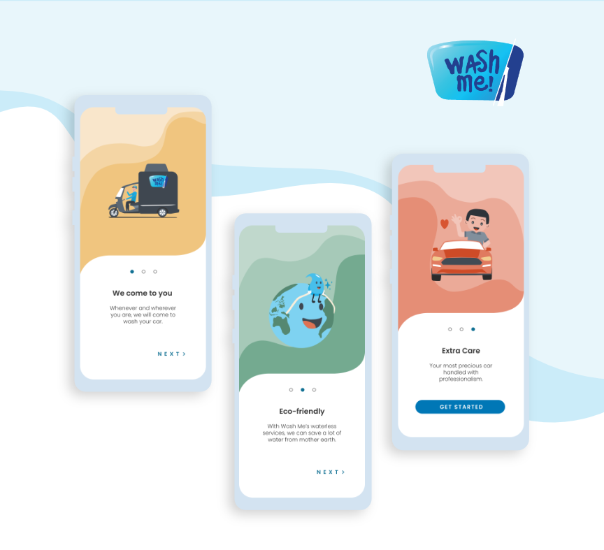
Wash Me, redesigned and rebuilt end to end
Where this started
Wash Me is a mobile car-washing company operating in the Philippines. They wash cars at the customer's location, priced by vehicle size across four service tiers. They already had a website and a mobile app.
Nobody hired us. We picked them for a redesign study on our own initiative, ran it end to end, and then kept going: past the wireframes, past the mockups, into a working platform with a live database behind it. When it was finished we sent the screenshots over. We are still waiting to hear back.
There is an honest limit worth naming here. The study covered what anyone can see from the outside, which is the customer-facing half: the website and the booking app. Everything behind that counter was invisible to us. We do not know how they dispatch a washer, how they price a franchise branch, or what their staff actually needs during a shift. So the crew experience and the operator dashboard are entirely our own design, built from how a franchise car wash business plausibly runs rather than from how theirs actually does. If they take this on, that half is a conversation, not a delivery.
Why we build before we are hired
Most studios need a signed contract before any design work begins. That is a reasonable way to run a business, and it carries one uncomfortable consequence: the client has to buy the outcome before they can see it. They are paying for a promise, backed by a portfolio of work done for somebody else.
We would rather invert that. Do the work first, at our own cost, and let the result make the argument. If the business adopts it, that is when compensation gets discussed. If they pass, we have spent nothing we would not have spent on a portfolio piece anyway, and they have risked nothing at all.
This is not a discount tier. The same study, the same standard, and the same build discipline apply whether a contract is signed on day one or never signed at all. That is the entire point of publishing it: this is the floor, not a sample.
The study was the part we could not skip. Before drawing a single screen we ran a competitor analysis on other mobile car wash operators in the market, audited the existing website and app against a seven-part framework covering imagery, branding, media, messaging, interactivity and layout, rewrote the customer-facing copy, and mapped the user flows. Only then did the wireframes start. Redesigning something without first understanding why it looks the way it does is decoration, not design.
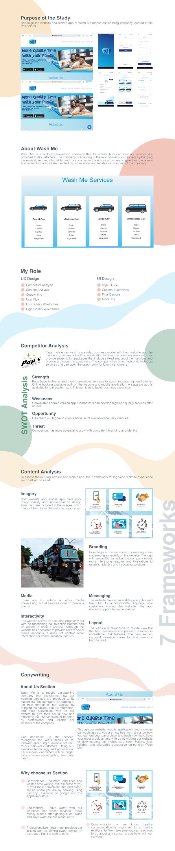
The study came first: competitor analysis, a content audit, copywriting, and user flows. Alt: UX study board for the Wash Me redesign showing competitor analysis and content analysis sections.
What we built
One app, two roles
Wash Me ships as a single mobile application. A customer and a washer download the same thing from the same store listing, sign in with their own account, and get two completely different products. The app reads the role on the account and renders accordingly: a booking flow and rewards for a customer, a job queue and status controls for a crew member.
That was deliberate. A washer and a customer are looking at the same booking from opposite ends. The moment those two views come out of two separate codebases, they start disagreeing about what is true.
For the customer, booking a wash takes five steps: pick the vehicle, pick the service, set the location, choose a time, review. Cars are saved once to a garage and reused. Addresses come from search with autocomplete, or from saved places like Home and Work. A wash can be booked immediately or scheduled for later.
Once it is confirmed the platform takes over, matching the booking to the nearest available crew and assigning it automatically. The customer then watches the job move from assigned, to en route, to in progress, to complete on a live map, with in-app chat to the washer handling it. Payment happens per booking with saved methods and receipts, and a loyalty layer runs underneath all of it: points on every wash, vouchers, promotional campaigns, a rewards catalogue to spend points in, and a referral program. Customers can raise support tickets, manage their vehicles, and sign in with Google or Apple.
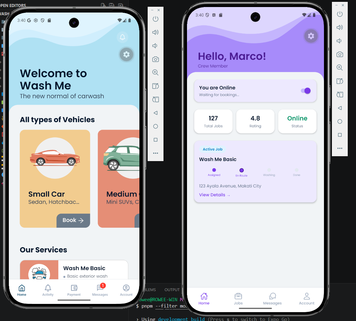
Home screen for customer and crew users
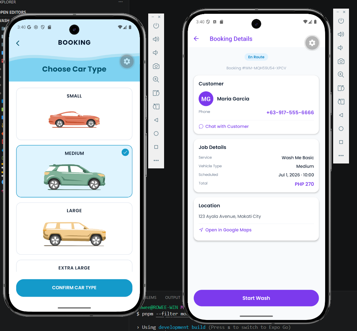
Left: Booking screen for customers; Right: Booking details page for crew
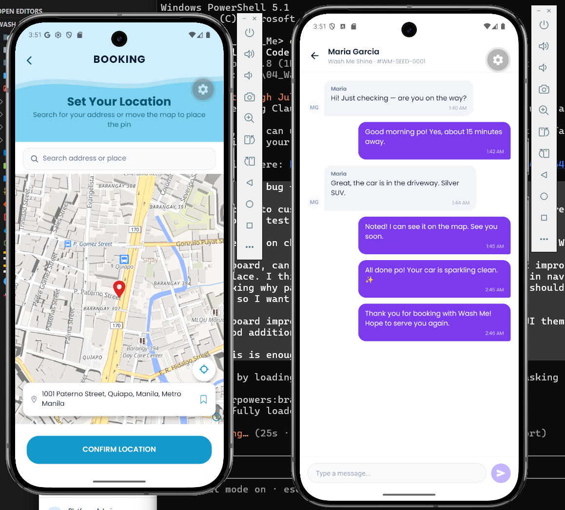
Left: Customer booking screen (pin location); Right: Crew messaging customer giving updates on the booking schedule
For the operator
The dashboard opens on a live board showing every active booking across the business, updating in real time over websockets, with no refreshing to find out what changed.
Around it sits the day to day: bookings, branches, crew, customers, a service catalogue with admin-managed vehicle types and per-branch pricing, service area coverage, payments, and analytics. The growth tools live here too (campaigns, vouchers, the rewards catalogue, referrals) alongside a support inbox and a block-based CMS that publishes posts straight to the public marketing site.
Like the mobile app, the dashboard renders by role. A platform administrator, a franchisee, and a branch manager all sign into the same application and each see a different one.
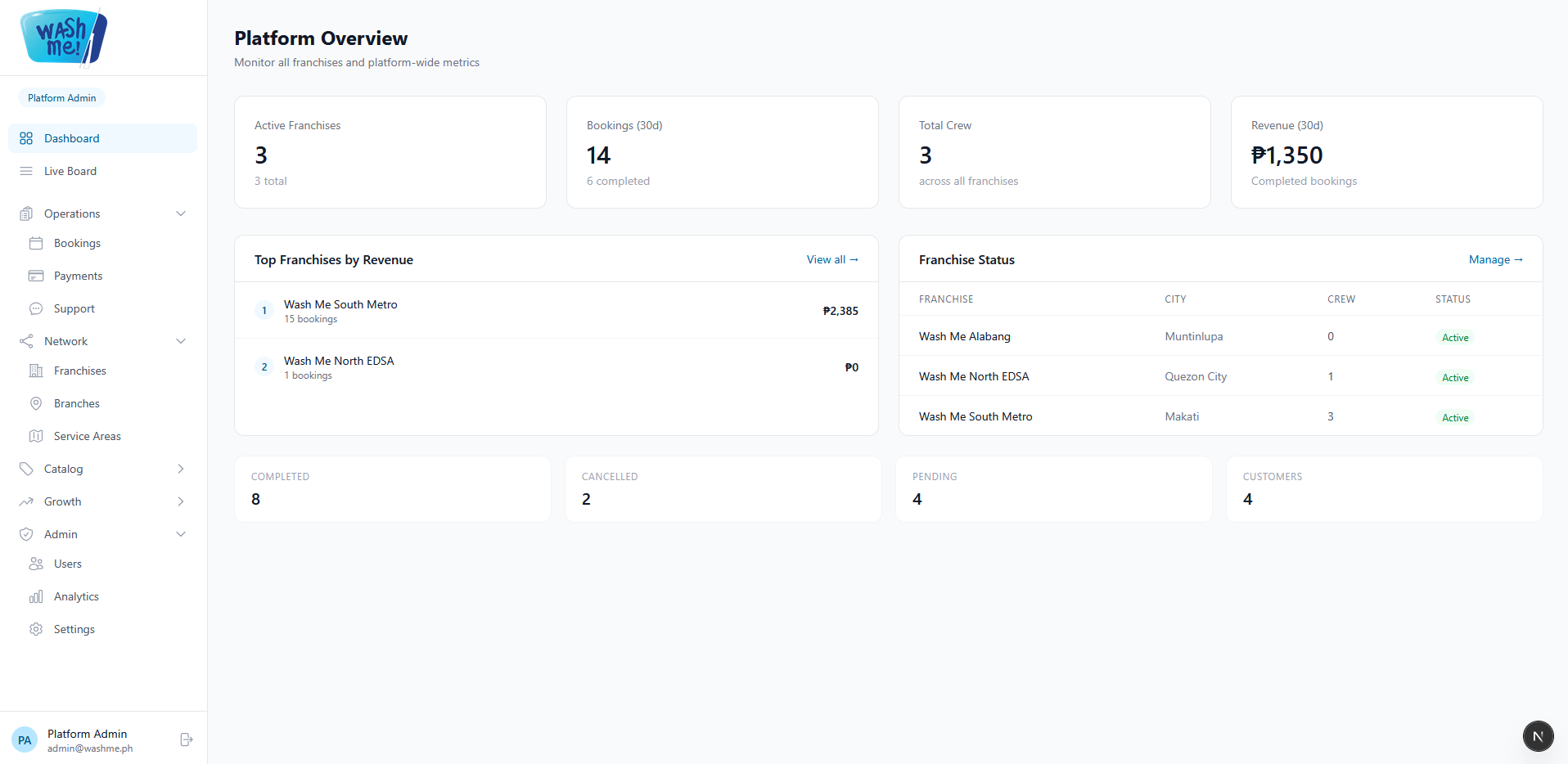
Platform dashboard changes access depending on role. Franchise and branches are initially set ready to get aligned with the actual flow of the business
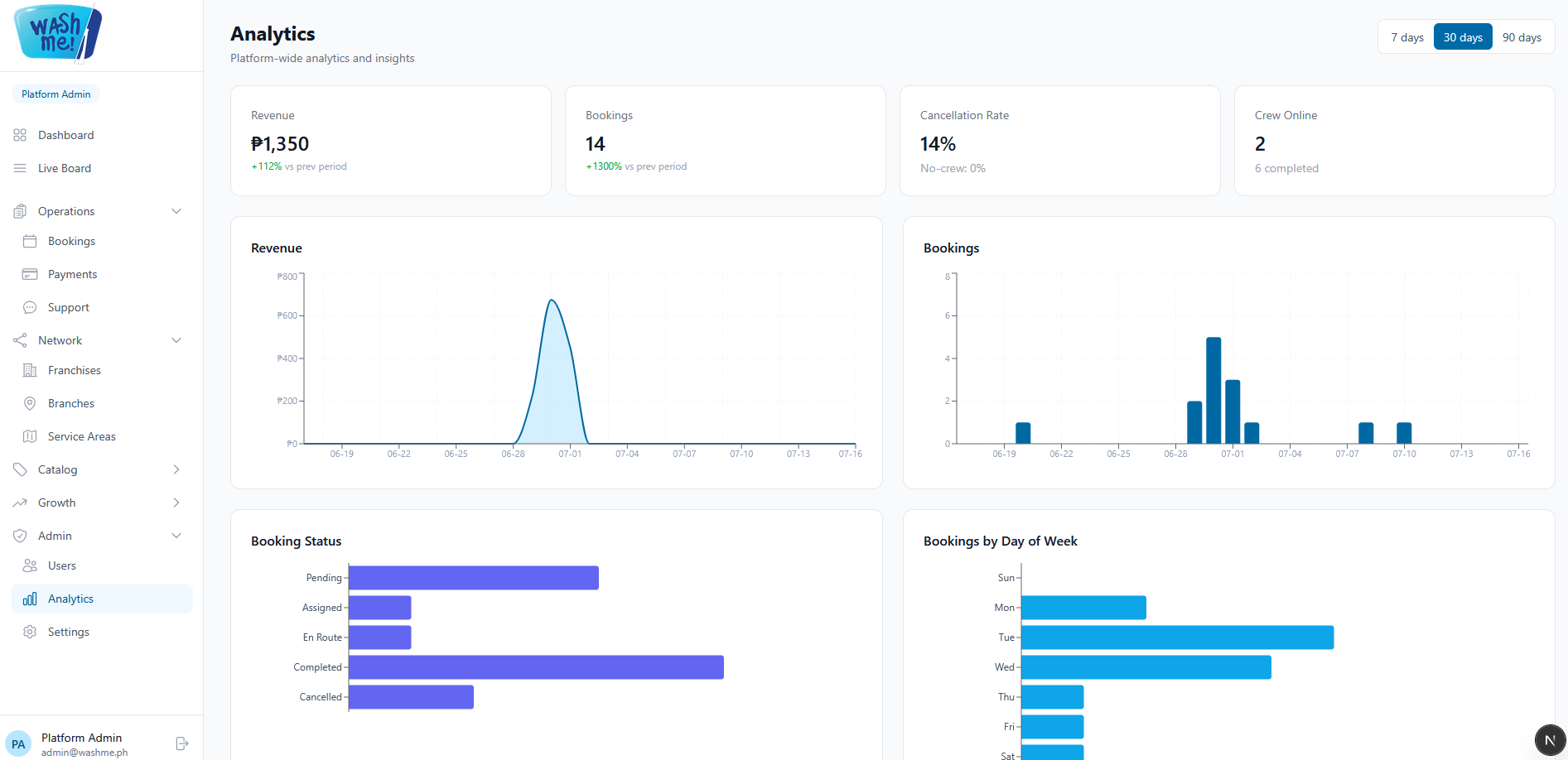
Analytics page
Access control and why it came first
There are five roles across the platform: platform administrator, franchisee, branch manager, crew, and customer. Franchise businesses mix company-owned branches with independent franchisees, which makes the rule strict. A branch manager must never reach another branch's data, and a franchisee must never reach another franchisee's.
That is enforced on the server, on every query, using a scope derived from the signed-in account. The interface hides what you cannot use, but the interface is not the security boundary. Changing a URL or editing a request gets you nothing.
We built that layer before we built any feature on top of it. Retrofitting data isolation into a system that already assumed everyone can see everything is one of the more expensive mistakes available in this kind of product.
The stack
One monorepo, built on Turborepo and pnpm, holding four applications and six shared packages.
Mobile: Expo SDK 56, React Native 0.85, Expo Router, Reanimated 4, MapLibre with OpenFreeMap for maps, Zustand for state, Socket.IO for live updates, and push notifications through Firebase Cloud Messaging.
Dashboard and marketing site: Next.js 16 on the App Router, React 19, Tailwind CSS 4, Recharts for analytics, and TipTap powering the block editor.
API: NestJS 11, Prisma 6, PostgreSQL, a Socket.IO gateway for real time, and S3-compatible object storage for media.
Shared: TypeScript end to end, with workspace packages for types, UI components, the editor schema, and Tailwind and lint configuration.
Payments: a provider-agnostic adapter with two implementations behind it, a development stub and a real processor ready to switch on.
The monorepo pays for itself daily. A booking status is defined once and imported by the API, the dashboard, and both mobile roles, so the crew view and the admin view cannot drift apart, because there is nothing to drift from. The payment seam earns its keep the same way: choosing a processor becomes a configuration change rather than a refactor. We did not want to lock the business into a payment provider months before they had an opinion about one.
How we would ship it
Everything deploys as Docker containers (API, dashboard, and marketing site) onto a single VPS, with PostgreSQL and Redis alongside them behind a reverse proxy. Contabo and Hostinger are both a comfortable fit.
That is a deliberate choice rather than a budget compromise. A business that has not launched yet has no traffic to scale for, and managed cloud pricing is essentially a subscription to capacity nobody is using. A VPS runs this workload comfortably at a fraction of the cost, and the difference is real money in a market where margins are thin.
The container is the insurance policy. The day the business outgrows one box, the same images run on DigitalOcean, AWS, or anywhere else that accepts a Dockerfile, which is a migration measured in hours rather than a rewrite measured in months. We would rather start cheap and keep the exit cheap than pay for scale as a hedge against success that has not happened yet.
From study to shipped screens
We designed the flow before we designed the pixels. The first artefacts were not screens at all, they were wireframes answering unglamorous questions. What does the customer see while a washer is ten minutes away? Where does a crew member tap when their hands are wet? What happens when nobody is available?
Only once those answers held up did we move into high fidelity. The visual system is built on pastel blues, wave-shaped headers, and custom vehicle illustrations drawn for the project rather than pulled from stock. It is deliberately not another grey dashboard. A car wash is a consumer service in a hot city, and the interface should feel like relief rather than paperwork.
The comparison set is the part worth studying: the preloader, the onboarding sequence, sign-up and login, the booking steps, the booking monitor, and the confirmation screen, each shown against what was there before.
The hardest design problem was fitting two audiences into one app. The customer experience is calm and spacious, with room for imagery and promotions. The crew experience is a tool: denser, higher contrast, a distinct purple identity, and laid out for one-handed use while standing next to a car. Shared components, two very different skins.
The dashboard got its own pass later. A unified brand palette, collapsible navigation grouping, and a full dark mode, with every colour pairing checked against WCAG AA contrast ratios rather than eyeballed.
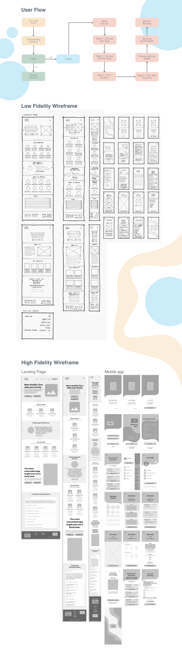
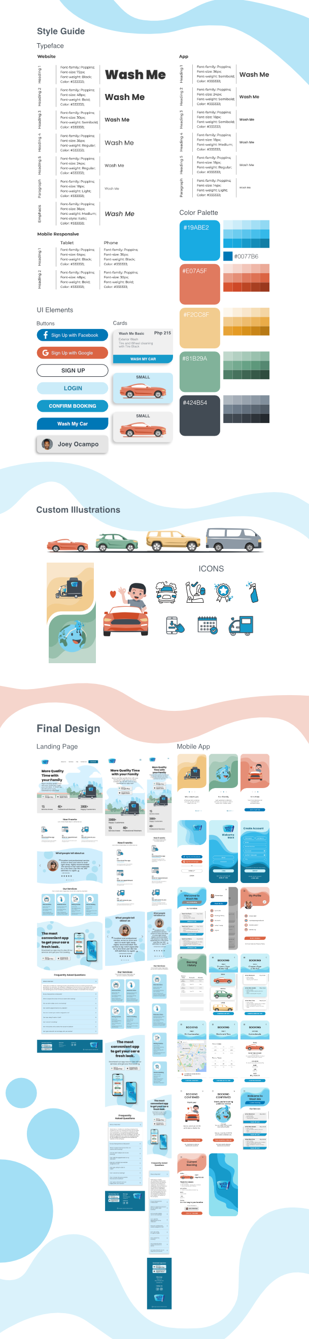
Wireframe, to high-fidelity design, to shipped screen.
Where it stands
Wash Me is feature-complete and in QA. Every flow described above is built and running against a real database. We are testing it on device now and fixing what we find.
Before it takes a real customer's money, a defined list remains: production secrets and environment hardening, monitoring and error tracking, automated backups, and the cutover from the development payment adapter to live processing keys. We know exactly what those items are and roughly what they cost, which is a very different position from "almost done".
The screenshots are with the company. If they say yes, this launches, and the half we could not see gets built properly with them in the room. If they pass, it stays right here as the clearest answer we can give to the only question that really matters: what can you actually build?
If you are running an operation that deserves better software than the spreadsheet it currently runs on, let's talk.
